Meet RiseUp Red Wing
Over the past few years, Red Wing Youth Outreach has changed a lot: from creating a new theory of action to growing our team tremendously to taking the helm of the Every Hand Joined partnership and expanding our work and mission. With that same commitment to growth and expansion, we knew it was time for our brand to evolve a bit, too.
We’re thrilled to share with you our exciting next chapter with our updated name, logo, mission, and vision. Meet RiseUp Red Wing.
Our new brand has come as the result of months of research, conversations, and refinements. After conducting a community-wide survey last fall, interviewing stakeholders at different levels throughout Red Wing, and supporting a youth focus group, we saw the need to refresh how we show up for youth, families, and our community. Red Wing Youth Outreach and Every Hand Joined are now one entity, with one mission and one shared goal of unleashing opportunities for our young people.
For three decades, Youth Outreach has been committed to making a difference in the lives of youth. And youth will always remain at the center of our work. We have expanded to uplift young people in even more ways – through engaging parents and families and through creating shared goals and actions with partners across the community. We are now doing much more than just outreach.
The Name’s Meaning
RiseUp Red Wing is intended as a community call to action. We are seeking to uplift youth and ensure our community offers abundant opportunities for all young people. Each of us has a role to play in building a thriving Red Wing, one where everyone feels included and valued for their unique talents.
The New Mission and Vision
Mission
We are on a mission to ensure Red Wing offers abundant opportunities for all young people to unleash their potential. We serve youth and families through caring, responsive programming, and we foster shared action among partners committed to supporting youth.
Vision
Our vision is a safe, vibrant Red Wing for all: Every young person has access to opportunities that help them reach their goals, youth and families are recognized as collaborators and leaders, and all Red Wing youth and community members feel valued, included, and empowered.
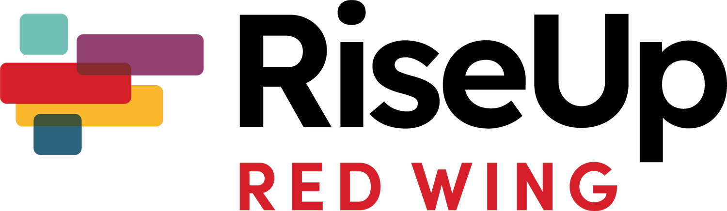
The Updated Visuals
We have a new logo, colors, fonts, icons, and more!
The mark in the logo represents:
An abstract letter “r”
Different lines we see as steps rising up; there are multiples paths youth can take to get where they’re going
Distinct colors that represent different groups, perspectives, and sectors coming together toward a shared vision of uplifting youth
An abstract wing that is prominent in so many local brands
And we’ve paired it with a clean, bold font.
One of our favorite parts of it is our new color palette, a warm and welcoming mix that was chosen by Red Wing youth!

The Language
You may notice that some of the language we are using has shifted, as well. As part of our commitment to diversity, equity, and inclusion, we are intentionally using asset-based language going forward. This means that we are focused on describing the strengths and potential individuals and groups bring. Rather than placing unfair blame on people for the circumstances they were born into, we will speak to the systems and policies that create disparities and bias. We know we have a long way to go still, and we are eager learners on this journey.
The Wrap-Up
We hope you are as excited to bring this new chapter to life as we are. Our intent was to use this rebrand to show up for our youth in more ways, ensuring they feel included, valued, and uplifted. We look forward to sharing more and continuing to grow, together.